Colour Coding for the Colour Blind
There are a lot of articles and sites out there that talk about selecting colour palettes for people who are colour blind. But when it came to this project, I found that no single post gave me the answer I was looking for. The goal appeared straightforward: add colour coding to a SharePoint calendar, and allow the user to filter the calendar items by choosing one of the categories, which are based on regions of North America. In the user’s business there are eight regions, so my first thought was to use the built-in calendar overlays and their set of associated colours. But there was a problem with that: the colours are limited to a predefined set and they didn’t work for my colour-blind user.
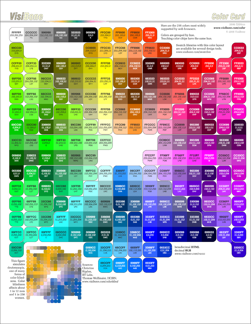
Eventually, I started with the colour palette from the TemplateMonster site (#1 below) – http://www.visibone.com/color/card_800.gif – and picked colours from the most contrasting areas, thinking of both the full-colour spectrum and the deuteranopia spectrum at the bottom left. Deuteranopia – red-green colour blindness – is one of the most common forms of colour blindness. Then I went to the WebAIM site (#2 below) and adjusted the colour to improve the contrast, choosing either black or white text, until the colours scored a pass for both WCAG (Web Content Accessibility Guidelines) AA and AAA standards; AAA is the highest level of conformance to the guidelines. I also made the size of the text bigger. The end result from my client was an enthusiastic “You are spot on with the color-blind ‘colors’. Very strong for me. That’s great!”
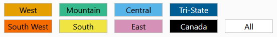
8 colour-coded regions
The colours are:
- West – orange – #e69f00
- Mountain – strong green-cyan – #33b98c
- Central – light cyan-blue – #56b4e9
- Tri-State – blue – #005d93
- South West – safety orange – #f66b00
- South – yellow – #f0e442
- East – medium red-violet – #d591b7
- Canada – black – #000000
Note that the colour names above are not HTML names, if you want to use them, copy the hex values.
In the end, these four sites were the most useful: